Friday, April 22, 2005
...It's a plane! No, It's a comparison!!!
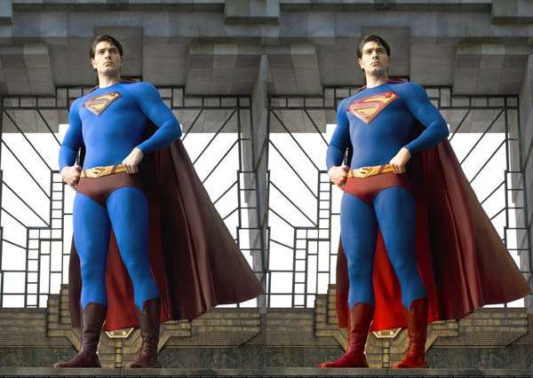
Click for a larger view of the picture
So, because I just don't have anything else to do, I've decided to take my criticisms and work them into the picture. Personally I think the changes that I've done make the costume look much better. As to what I fixed? Well just a simple tinkering with the colors (which I suspect is what will end up being done once they color correct the film), in which I toned down the cyan and added red (basically warmed up the picture) and increased the saturation of colors, that in my opinion make the suit look more iconic, doesn't end up making it look as garish as Christopher Reeve's costume (which, while he ruled, the costume has aged a bit badly).
The other thing that I changed is the shield, which was in my opinion the biggest problem of the new suit. I think that by making the shield bigger it helps break up the rather long blue abdominal section that is apparent on the picture. I also think that it looks much better that way, emphasizing the size of the shield in turn drawing the eye towards the shield, which in the end is what you would want.
UPDATE: Welcome any and all visitors from the movie blog (thanks for the link guys!) have a seat, leave a comment, read the blog :)
UPDATE: Seems to be comparison day for pictures, here is The Screen Rant comparing the err... beefiness factor of Batman and Superman. Needless to say, Batman would kick "Skinny Superman" butt anytime.

<< Home